

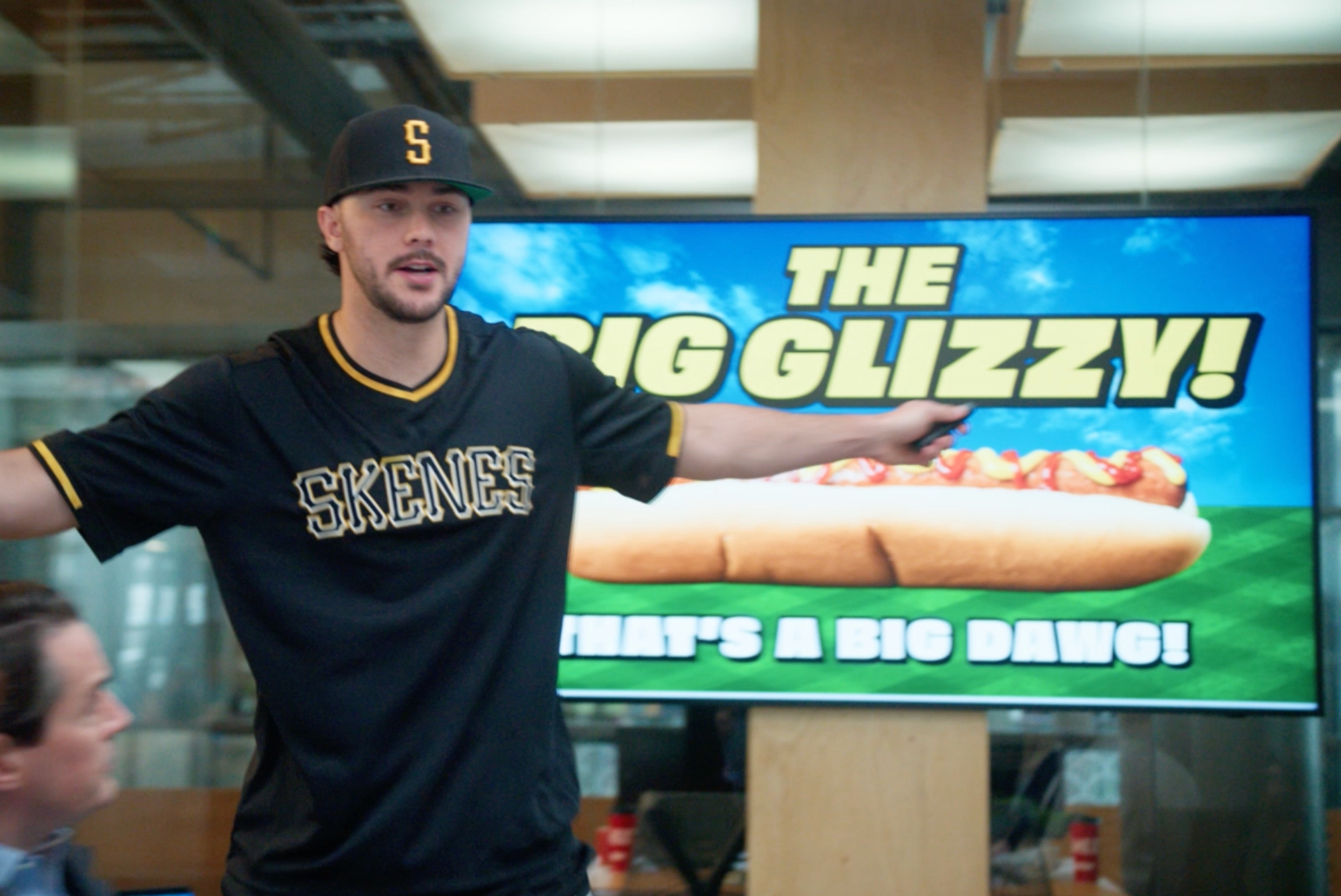
The Big Glizzy!
CLIENT: Sheetz – Product Creation & Launch, Video, TV, Stunt
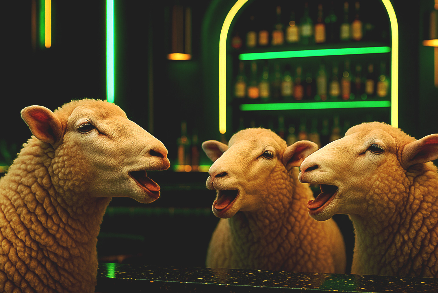
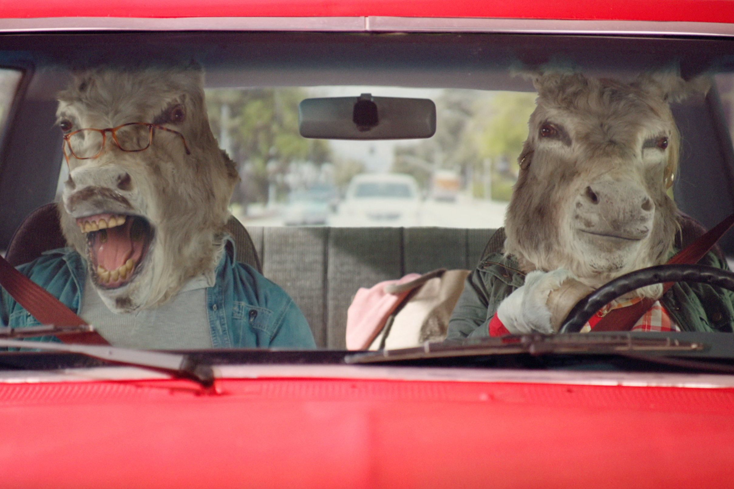
The Undomesticated Lager
CLIENT: Tsingtao Lager – Video
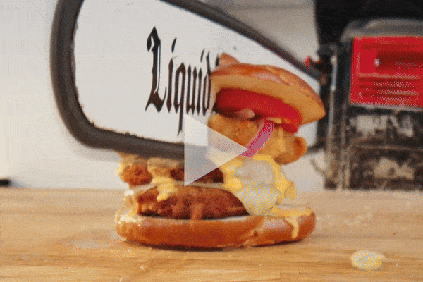
CHAINSAW SLICED SANDWICHES
Sheetz x Liquid Death – Stunt, Video, Merch, & Social
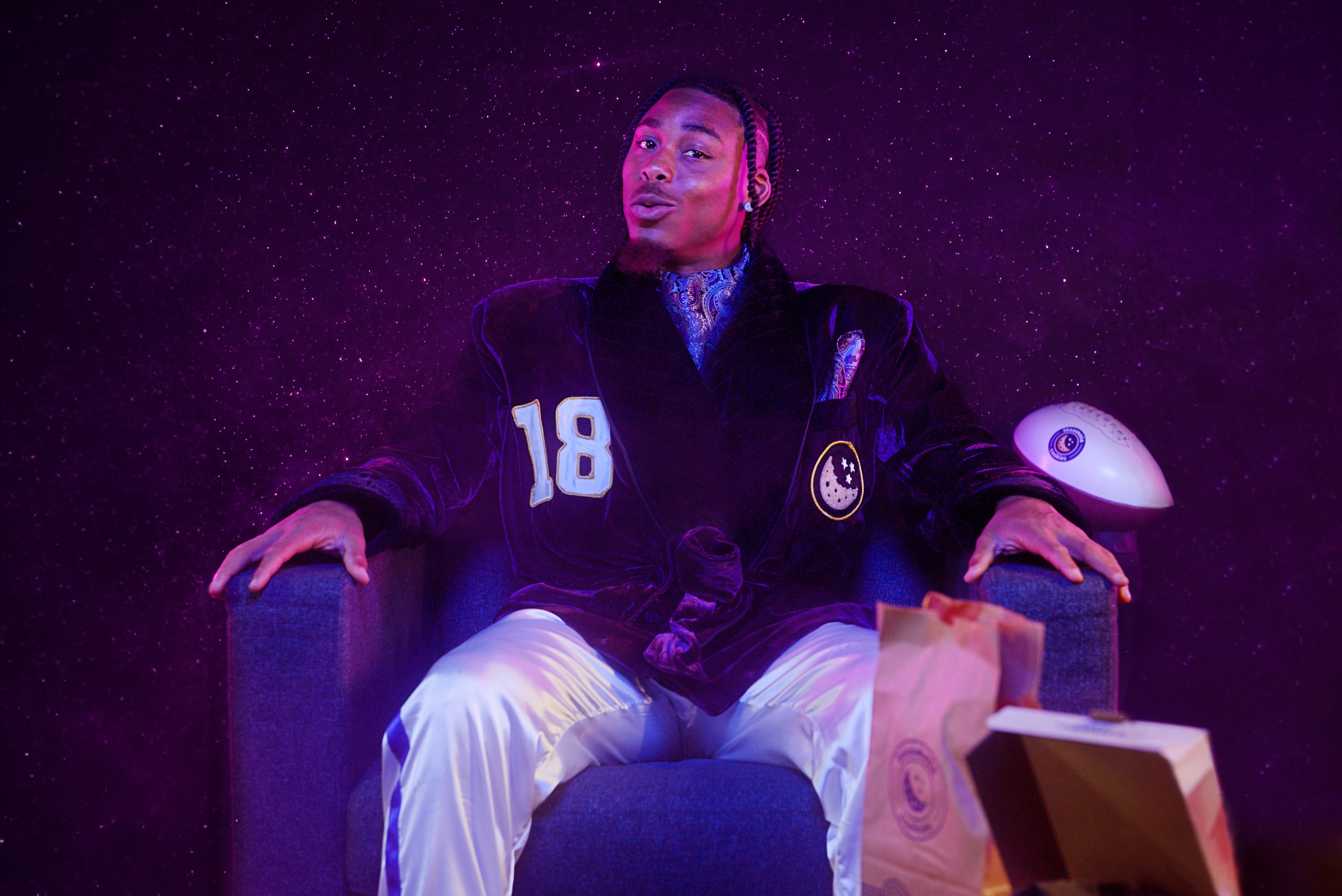
Delivering on Sundays with Justin Jefferson
Insomnia Cookies – Video, Photography, Social Media, Packaging, & POP
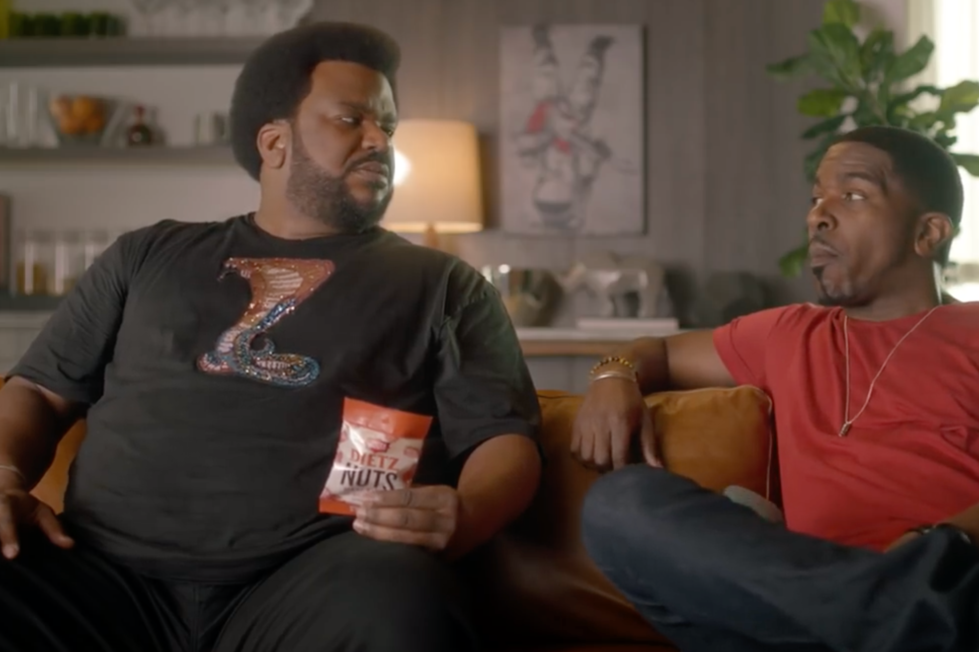
Dietz Nuts
CLIENT: Dietz & Watson – TV (Super Bowl LIII) / Digital Video
Dangerous Assumptions
CLIENT: Sheetz – TV (Super Bowl XLIX), Radio, Digital
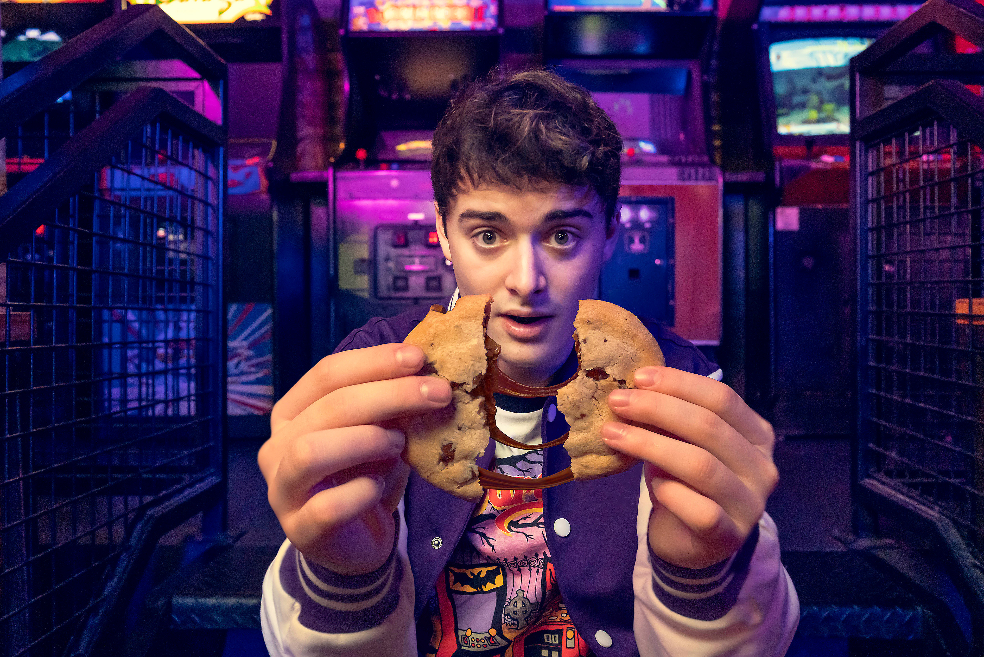
Noah Schnapp x Insomnia Cookies
Insomnia Cookies – Print, Photography, Packaging, Video, & Social Media
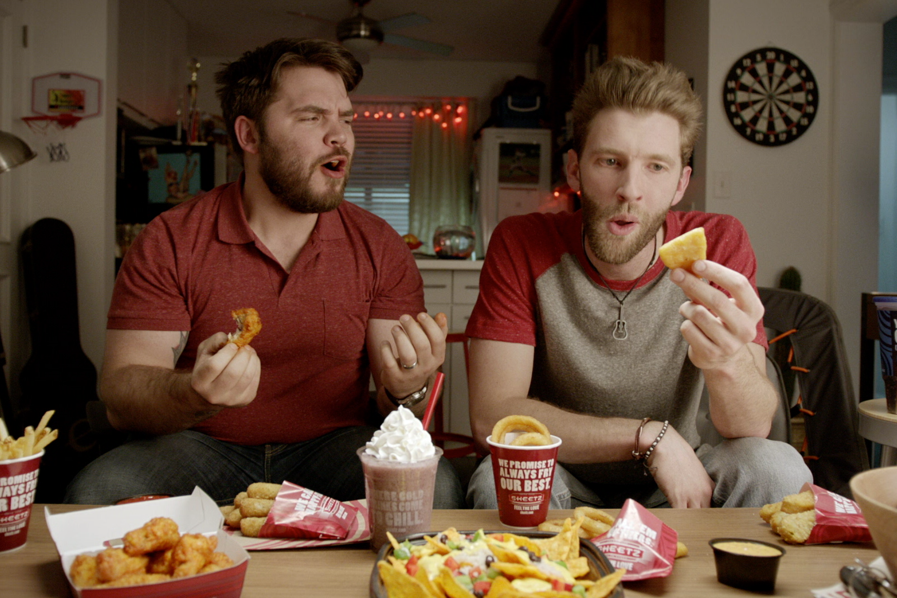
Feed Your Inner Sheetz Freak
CLIENT: Sheetz – TV, Digital Video, OOH, Social Media
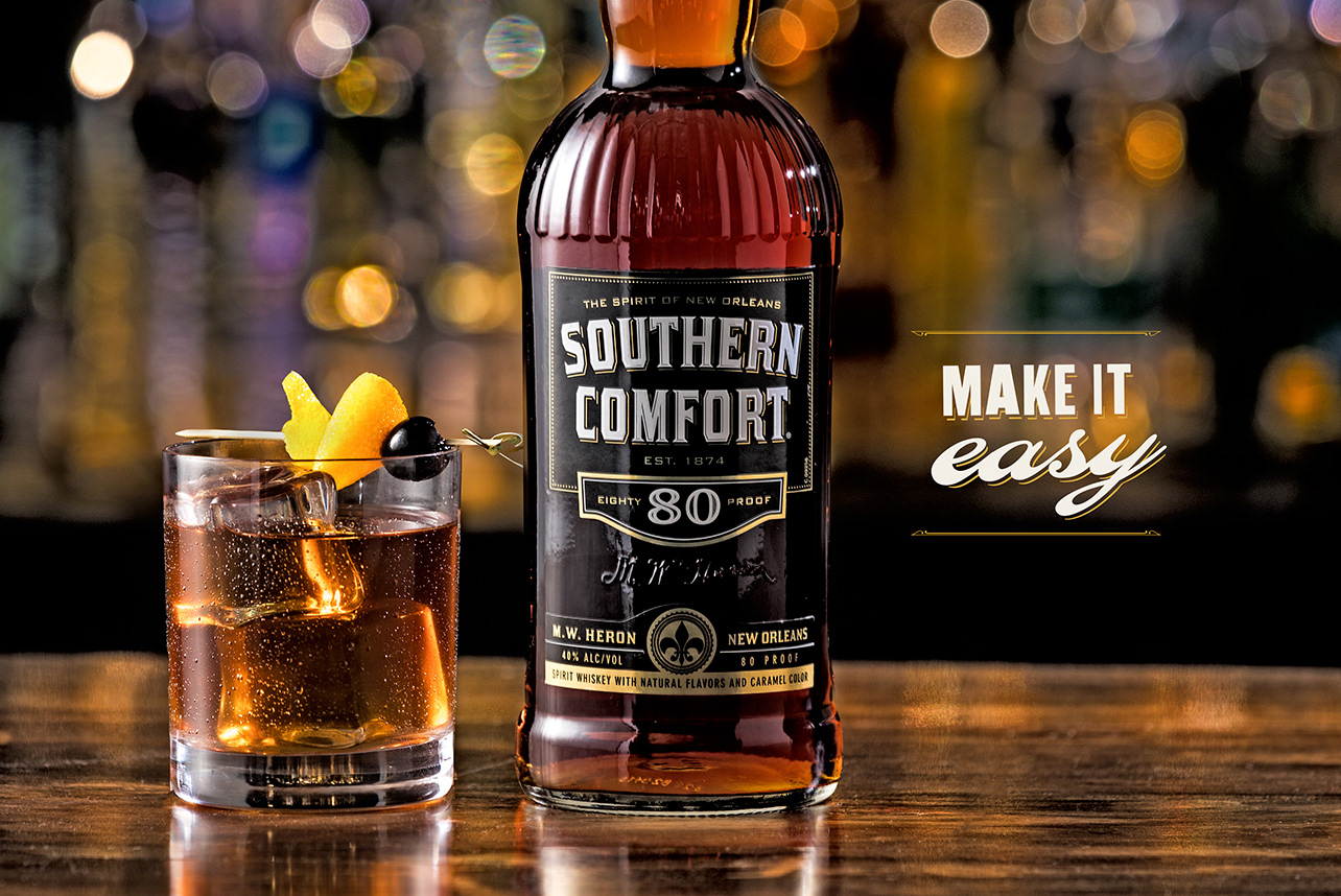
Make It Easy
CLIENT: Southern Comfort – Digital Video, Print, OOH, Experiential
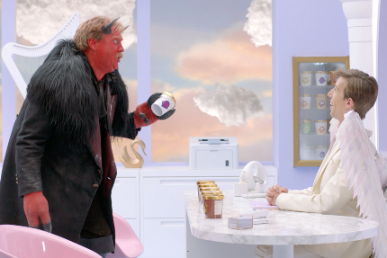
Angel & Devil
CLIENT: Halo Top Creamery – TV, Digital Video
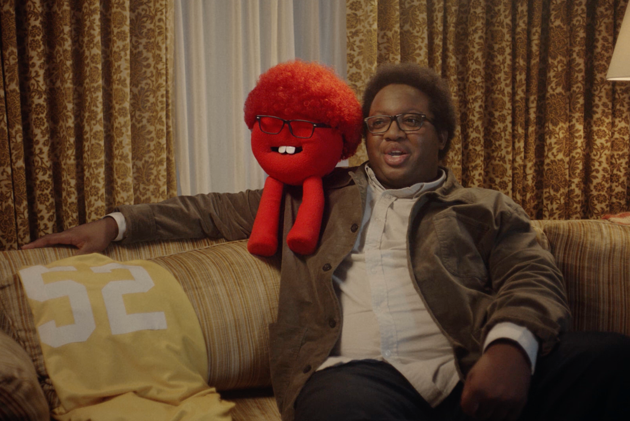
Deli Deli!
CLIENT: Dietz & Watson – Social Media, Guerilla
It's a Family Thing
CLIENT: Dietz & Watson – TV, Print, OOH
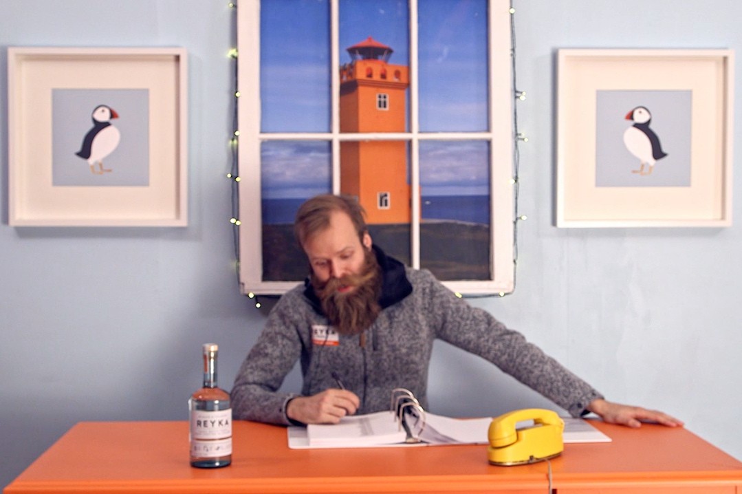
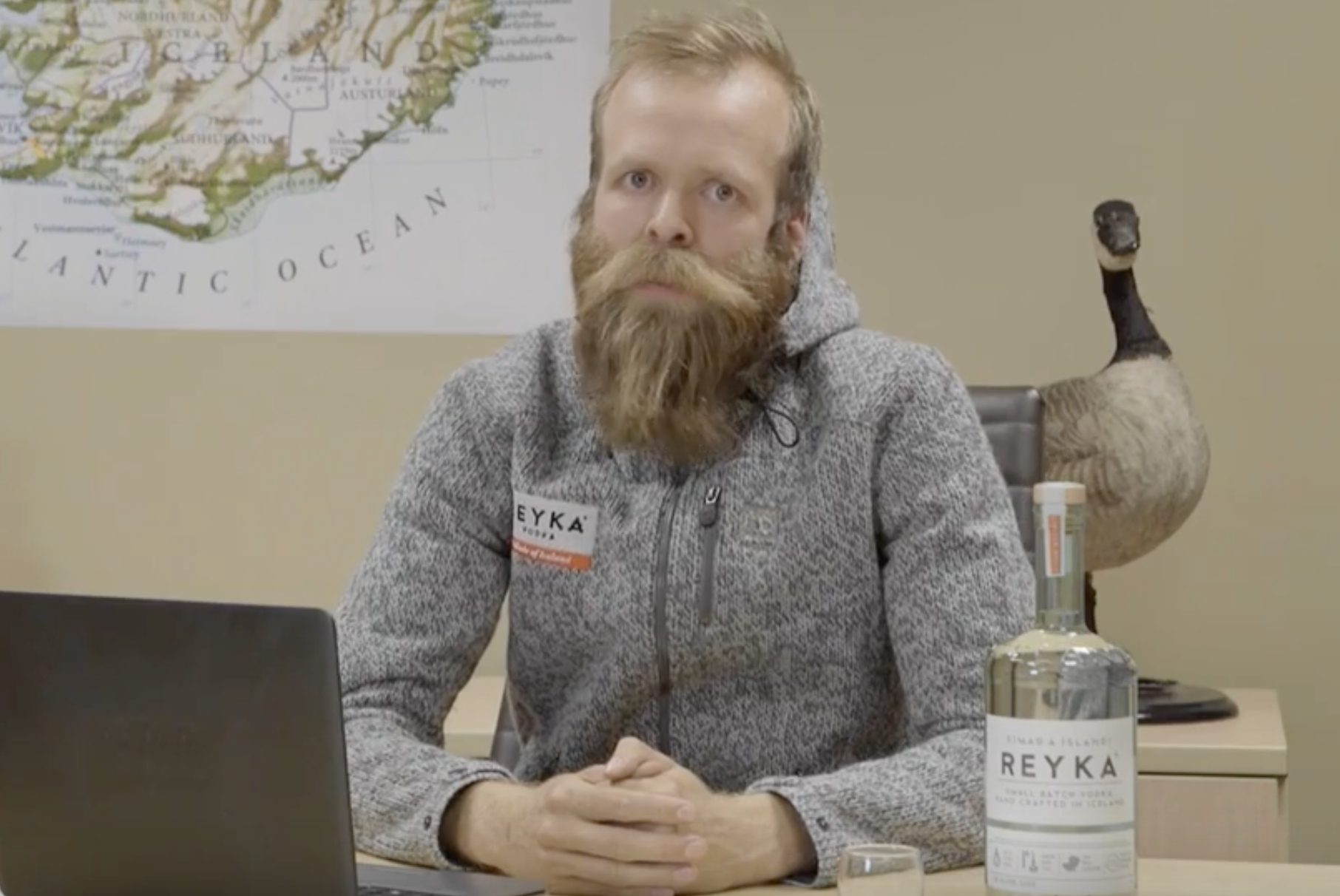
Reyka Vodka Holiday Wishes
CLIENT: Reyka Vodka - Social Media
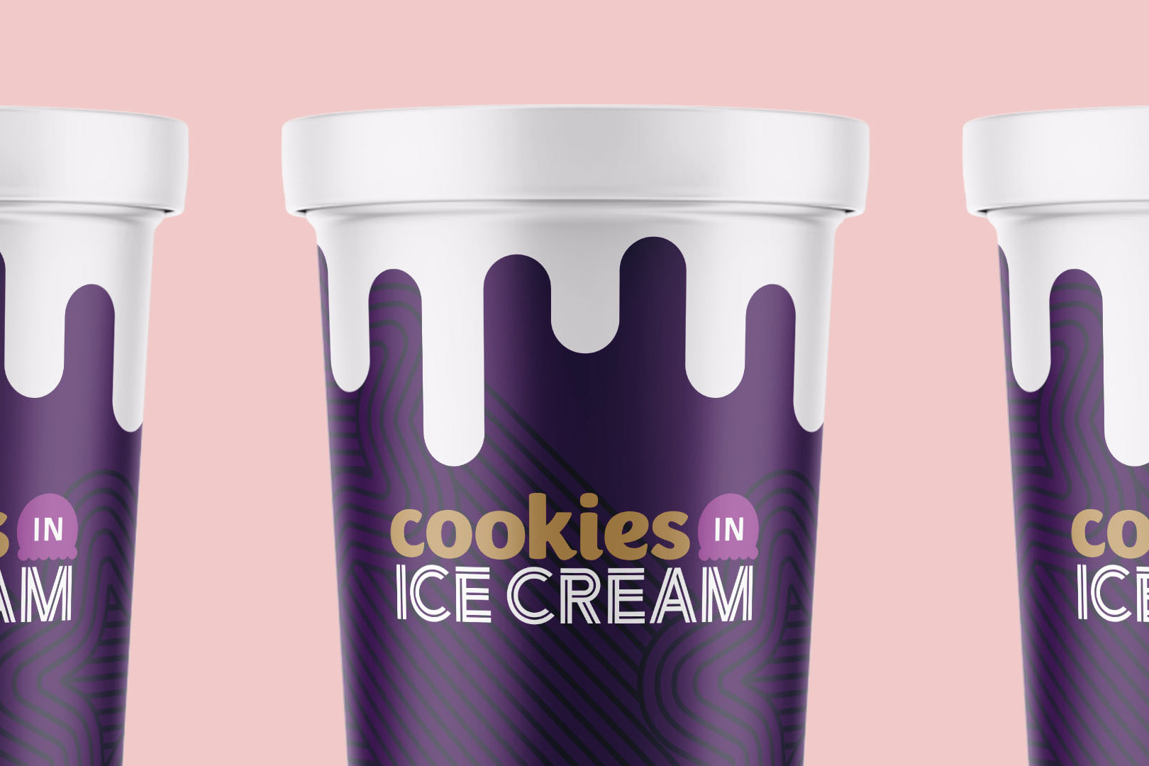
Cookies IN Ice Cream
Insomnia Cookies – Product Concept, Product Launch, Video, OOH, & Social Media
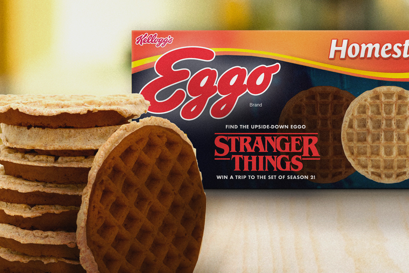
Eggo & Stranger Things Partnership
CLIENT: Eggo – Guerilla Stunt, Social Media, Product Concept Design
The Win by DICK'S
CLIENT: DICK'S Sporting Goods – Branding, Social, Photography, Digital Content

The Scent of Exhilaration
CLIENT: Victory Motorcycles – Print
A Gentlemen's Bet
CLIENT: Reyka Vodka – Digital Video, Social Media
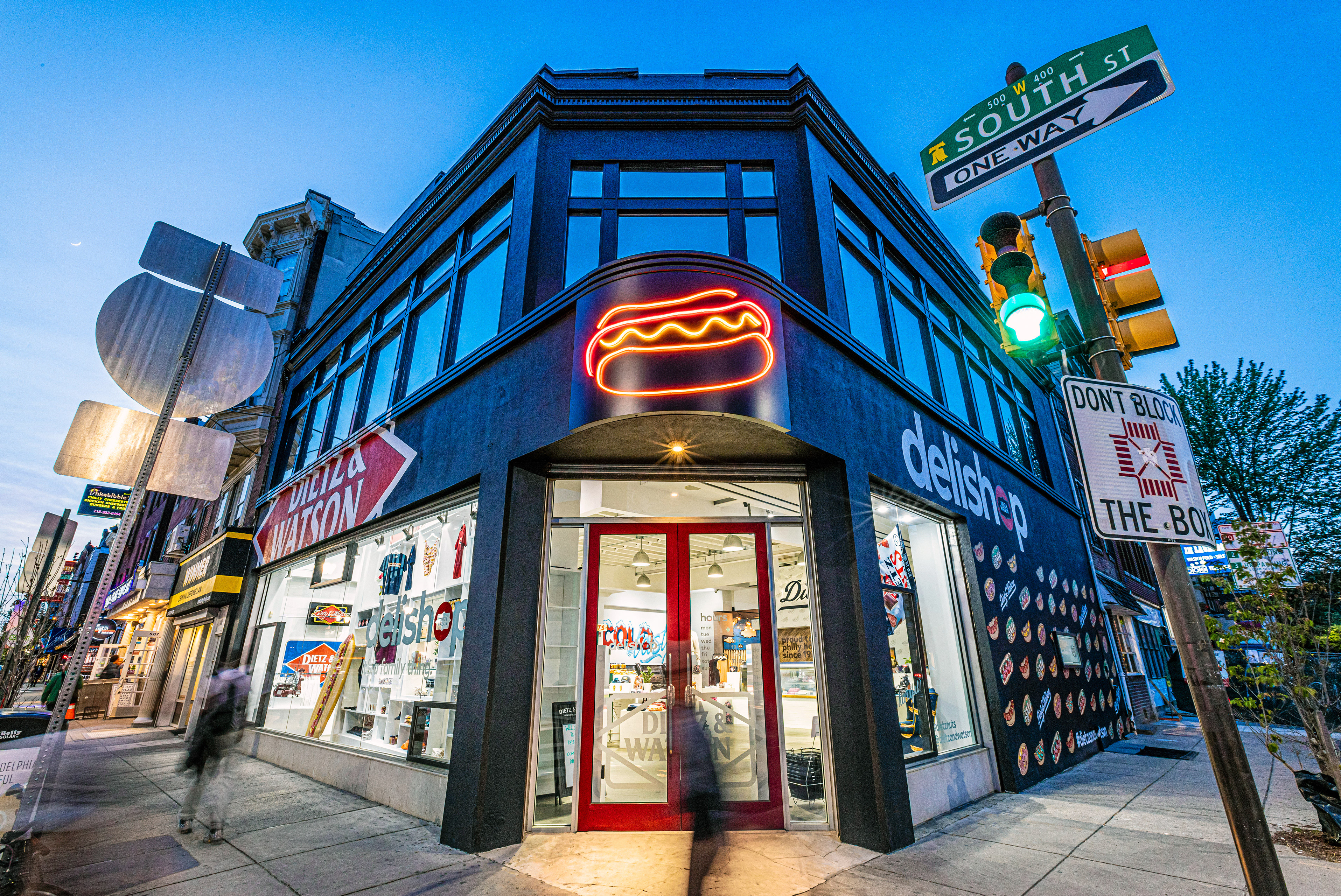
DeliShop
CLIENT: Dietz & Watson – Brand Experience / Merchandise Design
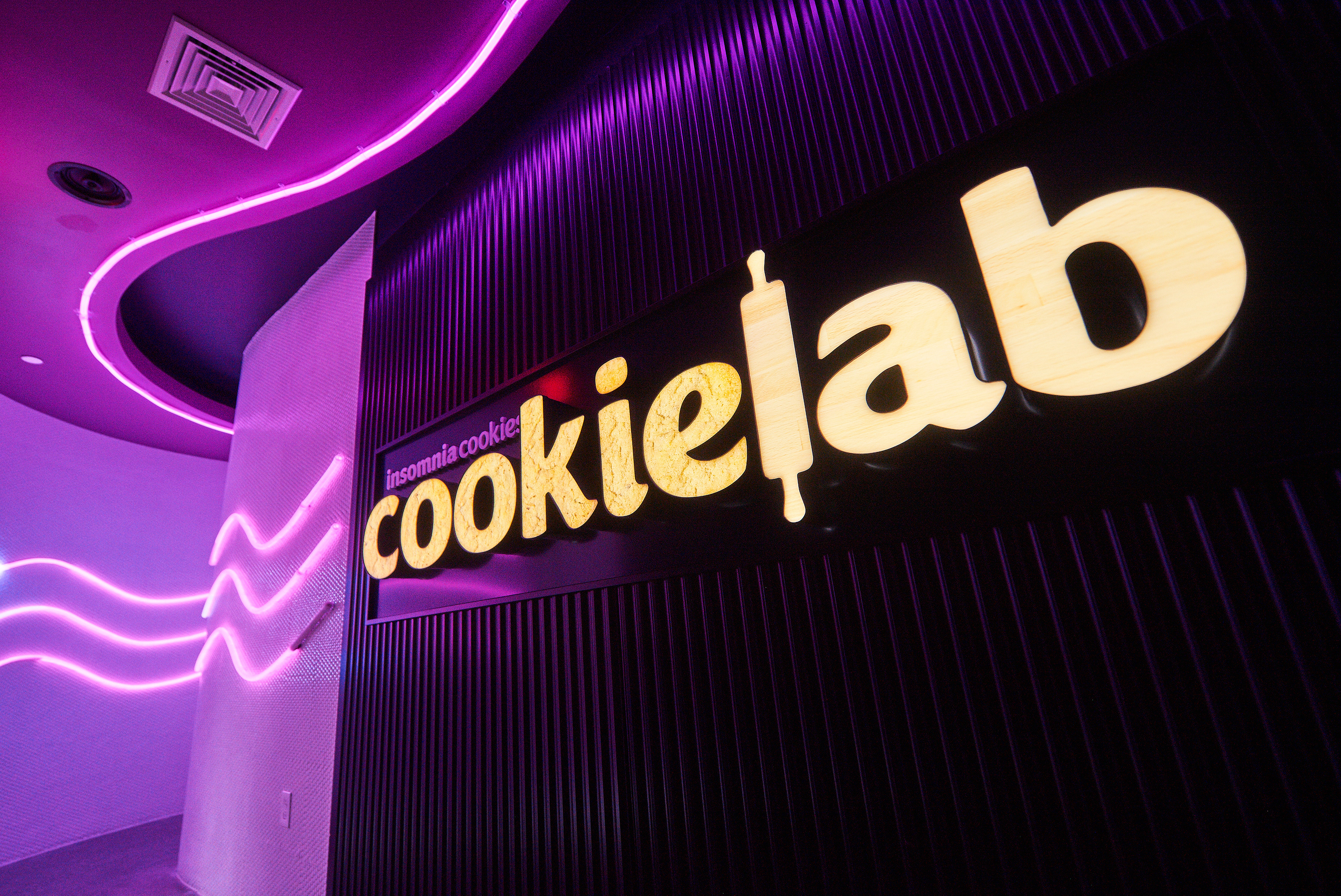
The CookieLab
Insomnia Cookies - Experiential Design, Packaging, Branding, Product Design
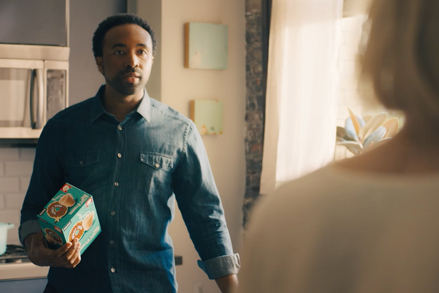
This Is Not a Coffee Shop
CLIENT: The Original Donut Shop Coffee – TV / Digital Video
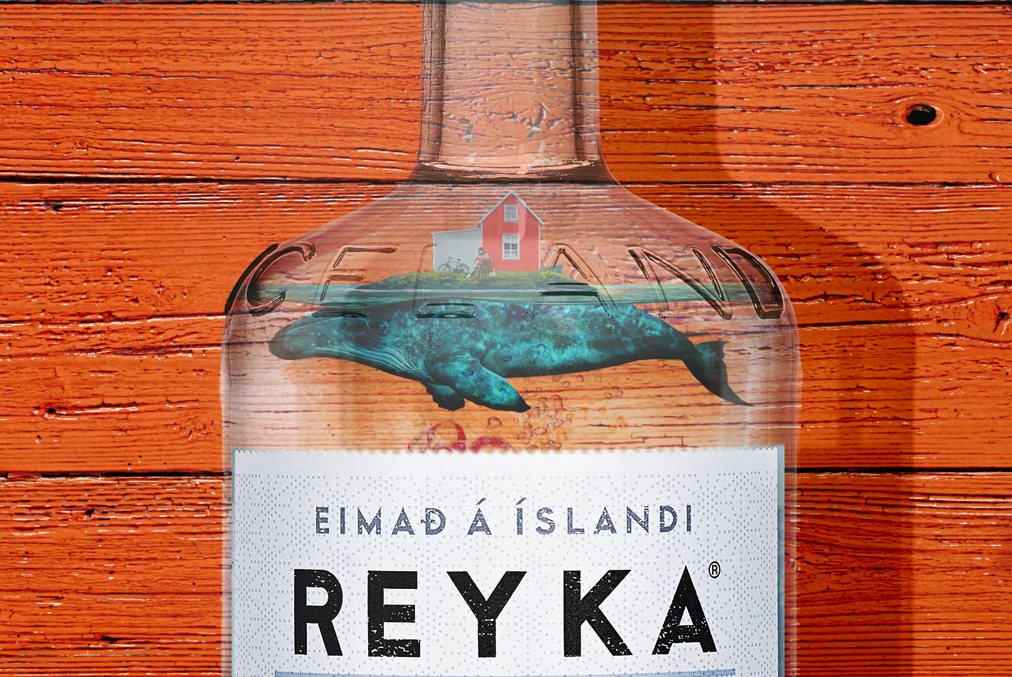
Made of Iceland
CLIENT: Reyka Vodka – Print, OOH, Digital
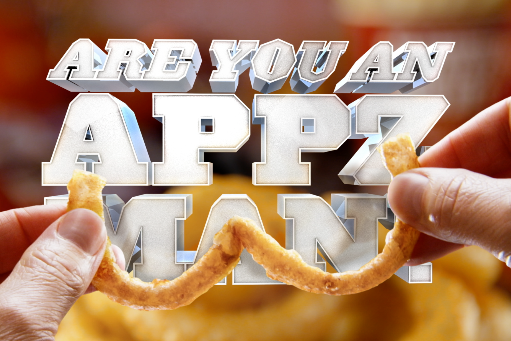
Are you an Appz Man?
CLIENT: Sheetz – TV, Digital, OOH, Radio
Exceed Your Tastepectations
CLIENT: Sheetz – TV, Digital Video, Social

Victory Motorcycles Re-brand
CLIENT: Victory Motorcycles – TV, Digital Video, Collateral, Branding
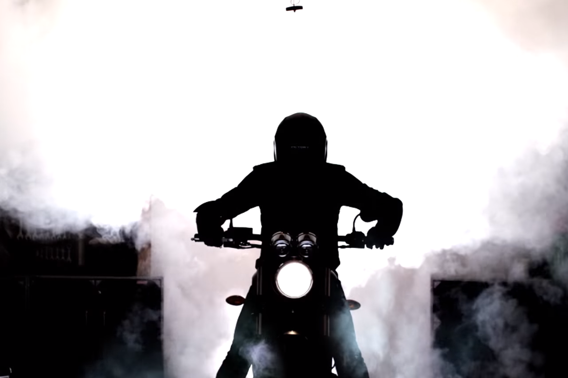
National Burnout Day
CLIENT: Victory Motorcycles – Digital Video, Digital, Guerilla, Social
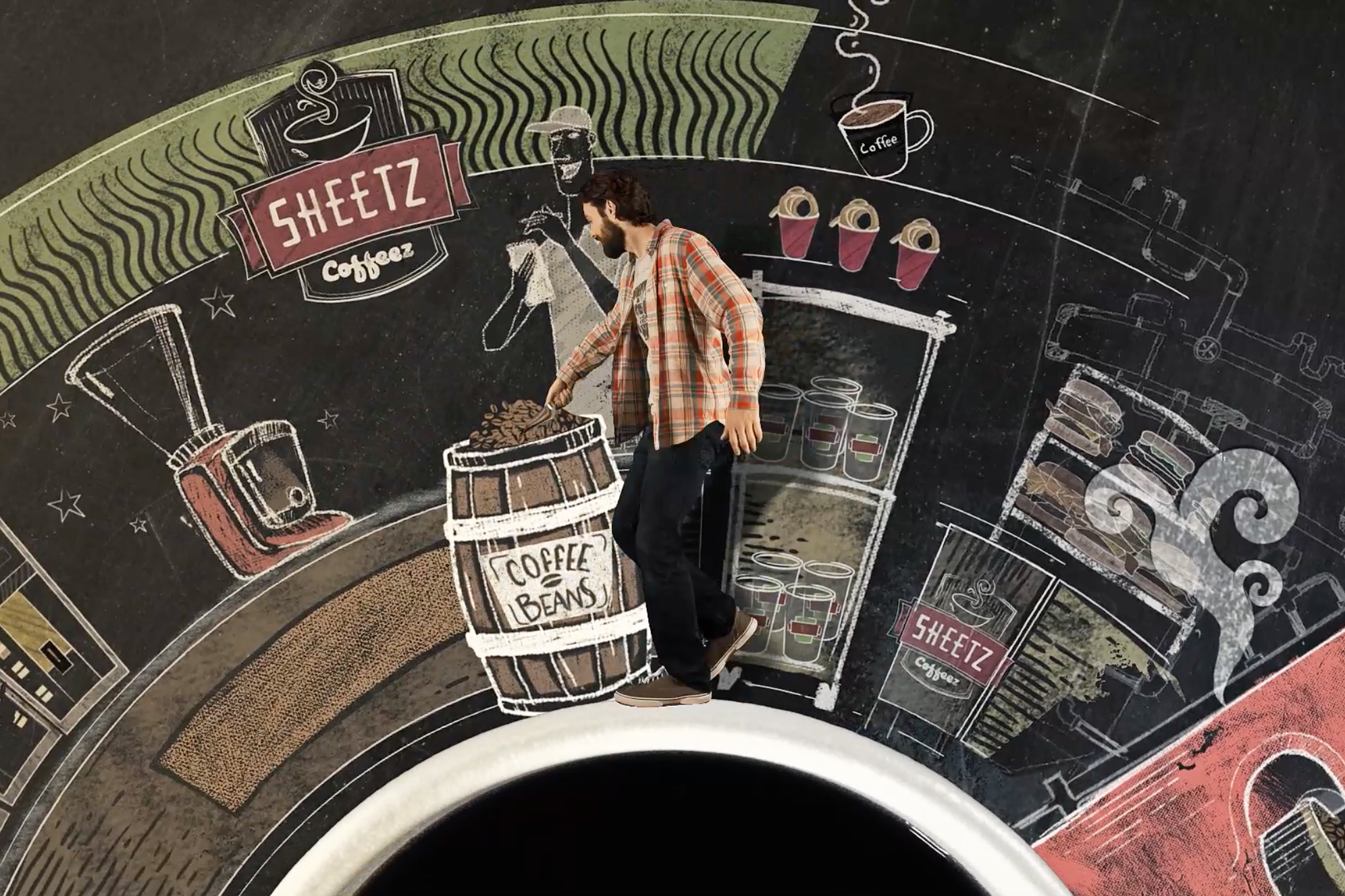
Sheetz Coffee Launch
CLIENT: Sheetz – TV, Digital, OOH, Branding, Radio
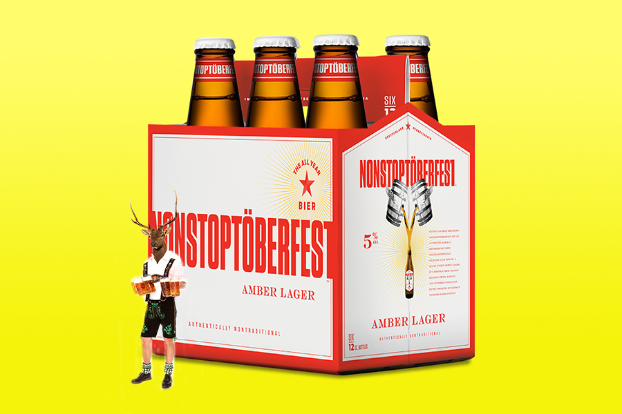
Nonstoptöberfest Bier
CLIENT: Nonstoptöberfest Bier – OOH, Print, Branding, Social
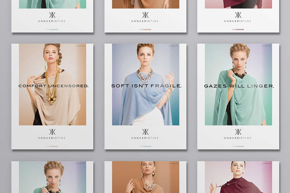
Anna Kristine Cashmere
CLIENT: Anna Kristine – Video, Print, Branding, Website
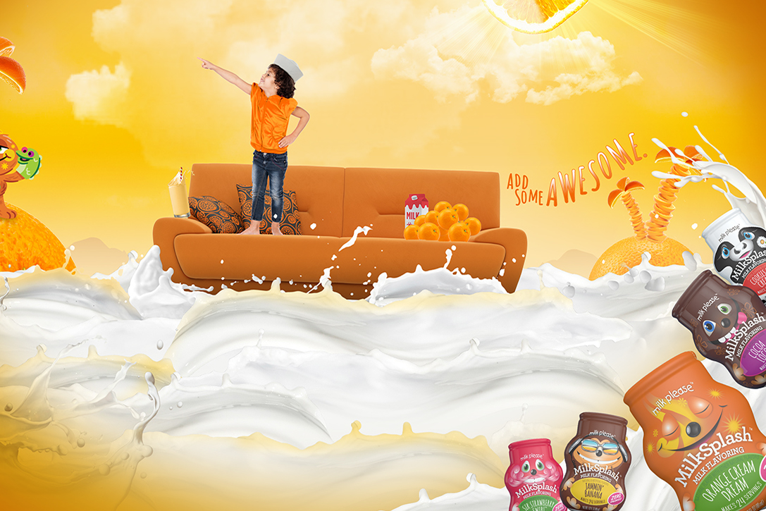
Add Some Awesome
CLIENT: MilkSplash – Print
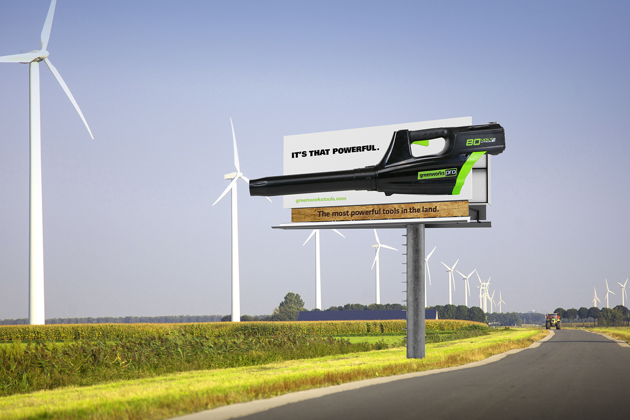
Most Powerful Tools in the Land
CLIENT: GreenWorks Lawn Tools – Print, OOH
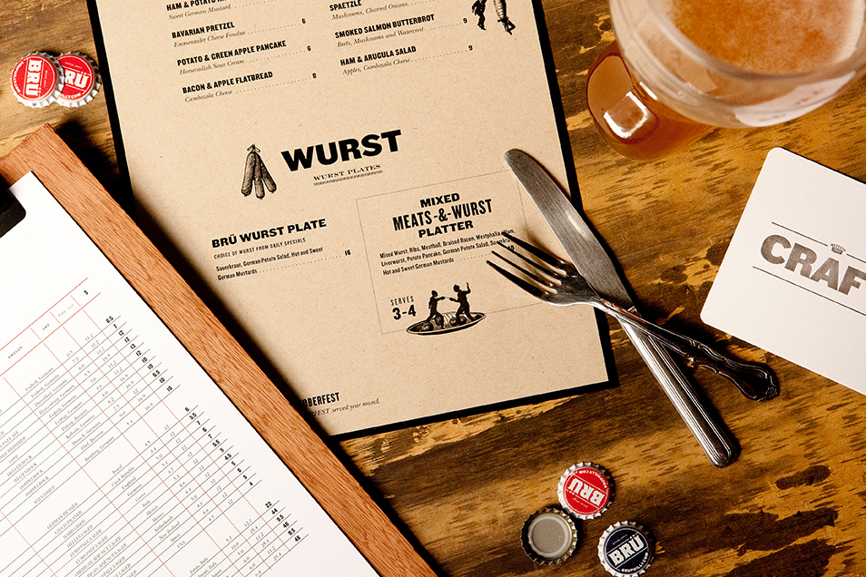
Brü Craft & Wurst Branding
CLIENT: Brü Craft & Wurst – Branding, Design, Web, Interior Design
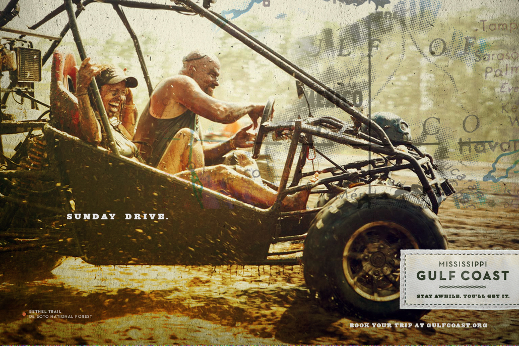
Gulf Coast Tourism Campaign
CLIENT: Gulf Coast Tourism – Digital Video, Print, Branding, Guerilla